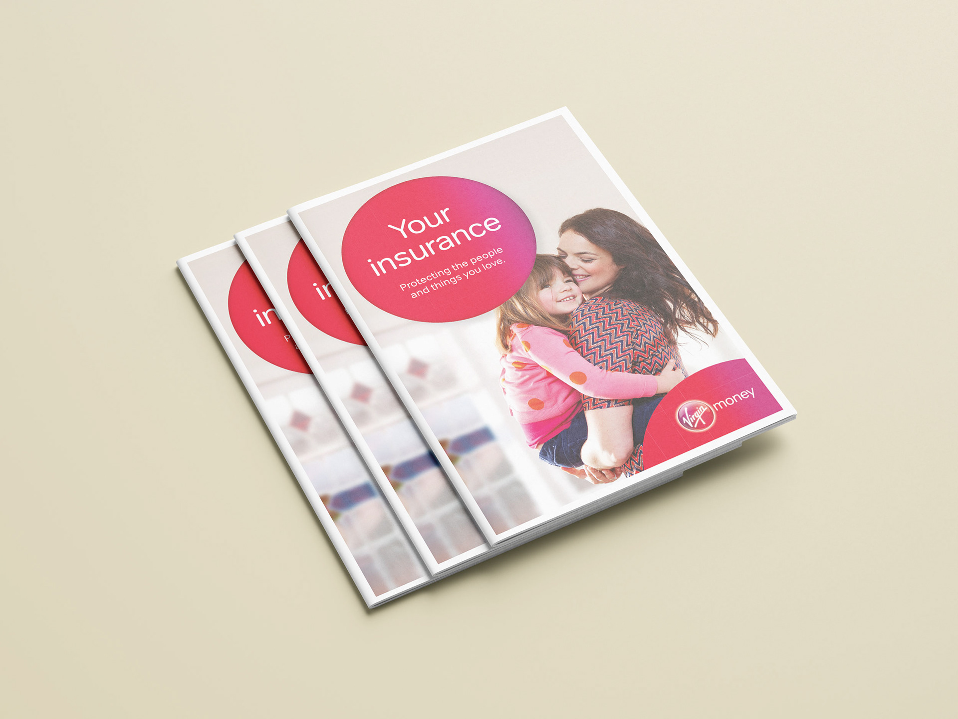
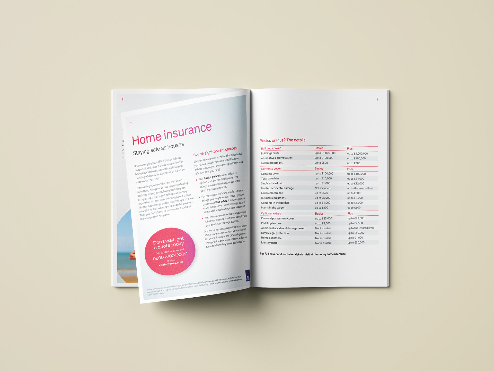
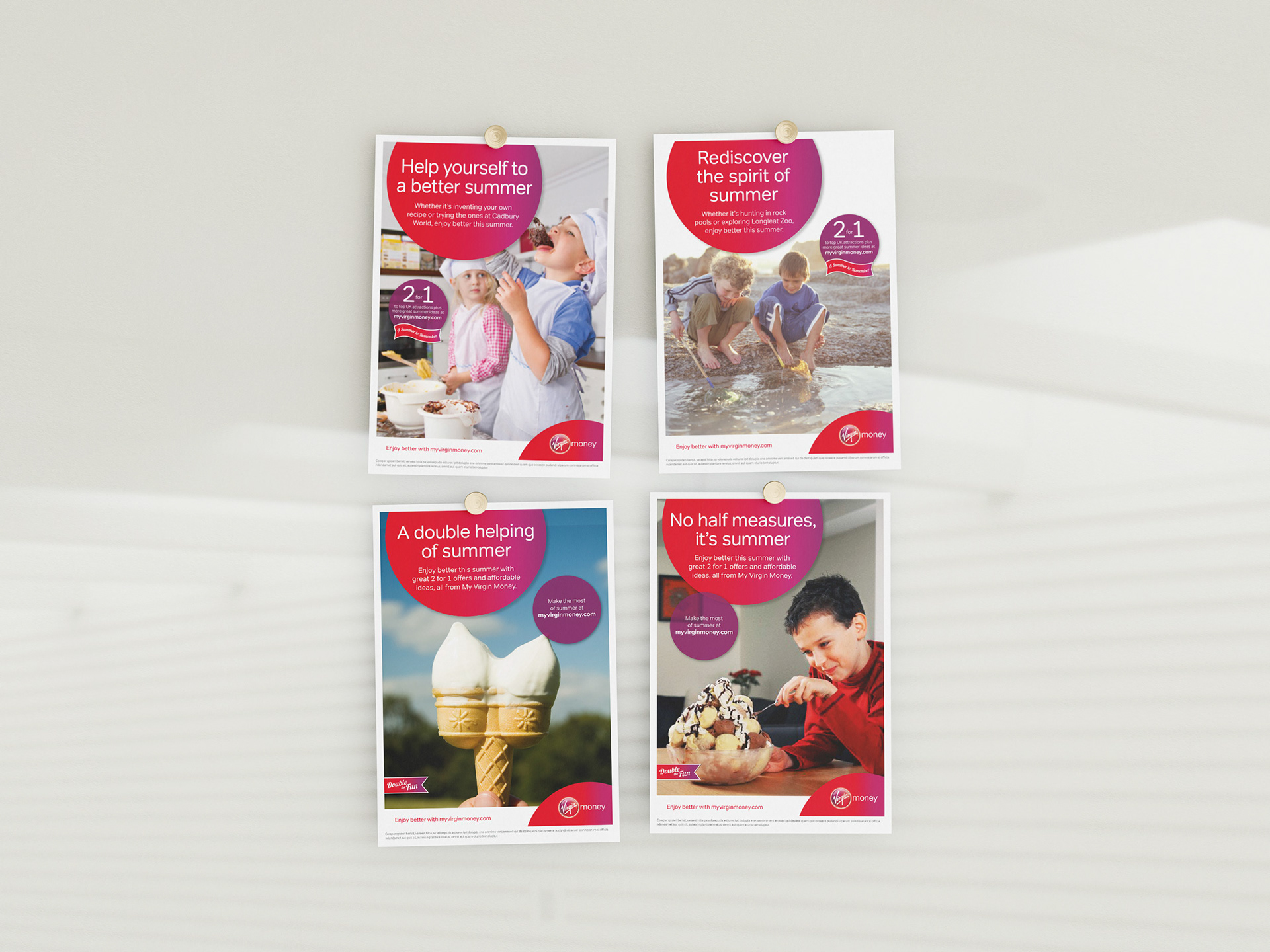
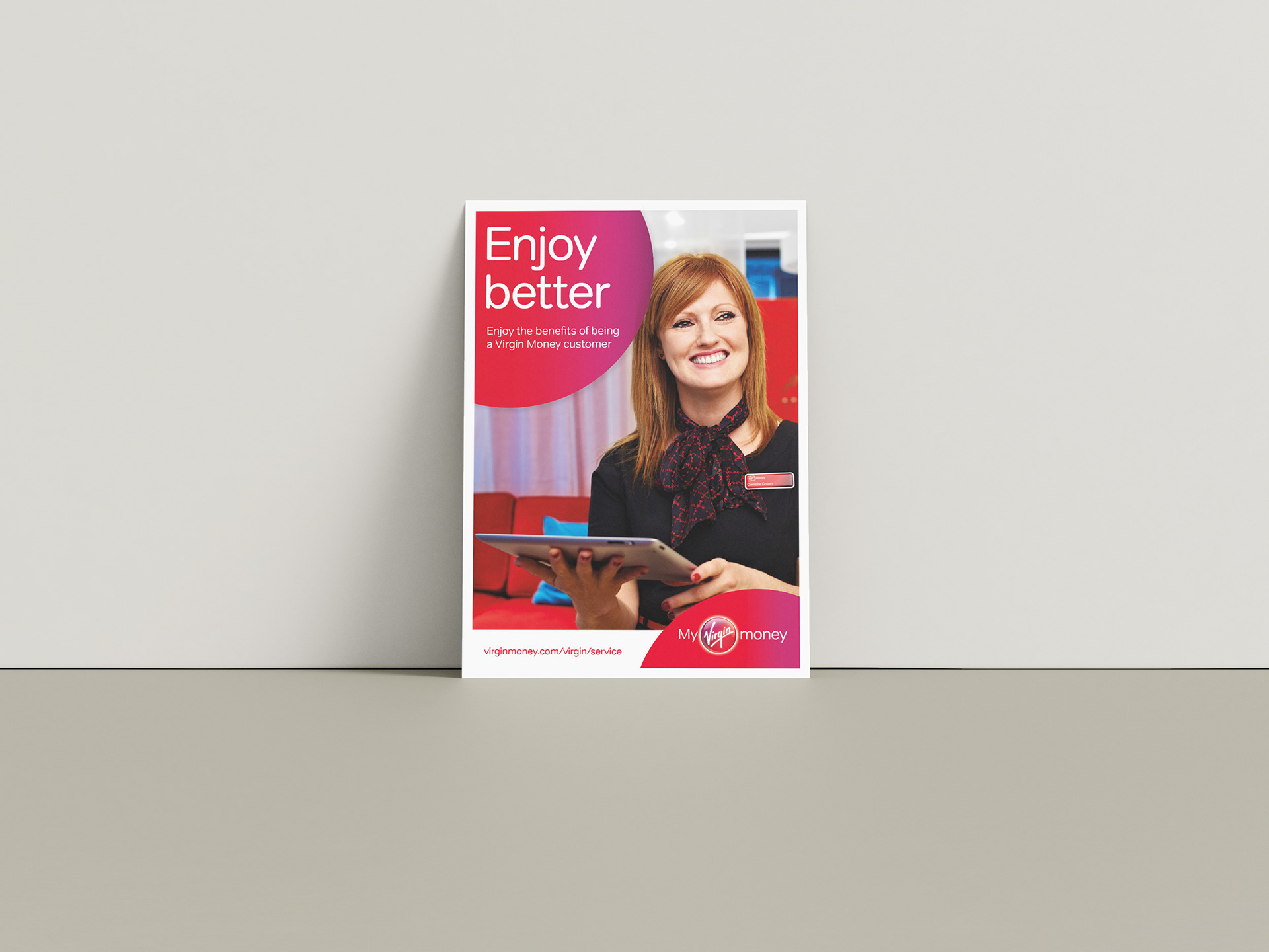
Virgin Money’s quest is to make banking better, and this is constantly reflected throughout their literature. Brand colours are bright and vibrant with images tweaked to increase the saturation. In-branch product brochures had to work hard to achieve cut-through in a Virgin Money branch where everything is bright, eye-catching and the environment busy. A die-cut front cover was created on the brochure front cover which helped to create extra interest and encourage people to pick them up and take a closer look. The choice of copy was direct and appealed to ‘you’ the individual, no one else.